Creating a strong brand identity is key to standing out in today’s crowded market. A well-thought-out design guidelines template lays the groundwork for how your brand is perceived. It helps ensure that every visual and verbal element aligns with your core values and mission. This article will guide you through essential steps to build a cohesive brand identity that resonates with your audience and stands the test of time.
Key Takeaways
- Define your brand’s mission and values to establish a solid foundation.
- Choose a color palette and typography that reflects your brand’s personality.
- Craft a versatile logo that can be used across various platforms.
- Develop a consistent brand voice to connect with your audience effectively.
- Regularly review and adapt your brand identity to stay relevant.
Understanding Your Brand’s Core Identity

Let’s kick things off by figuring out who you really are. It’s like that moment in a movie where the hero discovers their true calling, but instead of saving the world, you’re building a brand. It’s all about getting down to the nitty-gritty of what makes you, well, you. This part is all about soul-searching, but in a business-y, let’s-make-money kind of way. A strong brand identity is crucial for marketers.
Defining Your Mission and Values
Okay, so what gets you up in the morning? No, really. What’s the big, hairy, audacious goal that makes all the hard work worth it? That’s your mission. And your values? Those are the principles that guide you along the way. Think of them as your brand’s moral compass.
- What problem are you solving?
- What impact do you want to make?
- What do you stand for?
Identifying Your Target Audience
Who are you trying to reach? It’s not enough to say "everyone." You need to get specific. Really specific. What are their hopes, dreams, fears, and favorite pizza toppings? Knowing your audience inside and out is key to crafting a message that actually resonates. Understanding your audience is the first step in creating a brand that connects.
Crafting Your Unique Value Proposition
What makes you different? In a sea of sameness, what makes your brand stand out? This is your unique value proposition (UVP). It’s the promise you make to your customers, the reason they should choose you over the competition. It needs to be clear, concise, and compelling. Think of it as your brand’s superpower.
Your UVP isn’t just a slogan; it’s the core of your brand’s promise. It’s what you deliver consistently, and it’s what sets you apart. Make sure it’s something you can actually deliver on, or you’ll end up with a lot of disappointed customers.
Creating a Visual Language That Speaks
Alright, let’s talk about making your brand visually appealing! It’s not just about slapping a logo on everything; it’s about crafting a whole visual world that people instantly recognize as you. Think of it as giving your brand a unique style so that it can be easily identified.
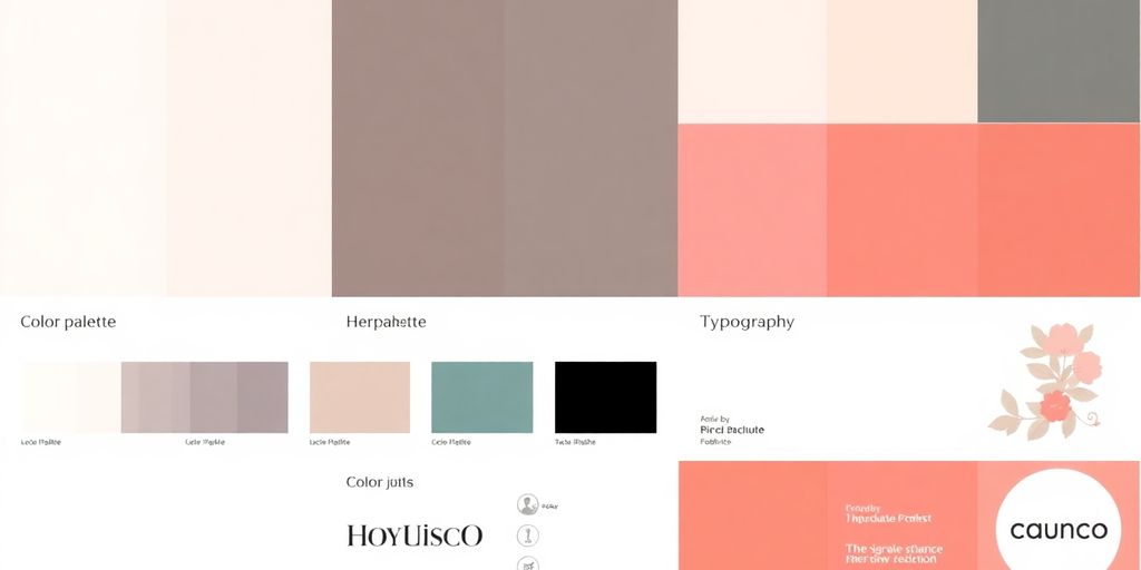
Choosing the Right Color Palette
Colors are powerful! They evoke emotions and set the mood. Your color palette should reflect your brand’s personality. Are you energetic and playful? Maybe bright, bold colors are the way to go. Sophisticated and trustworthy? Consider a more muted, classic palette. Don’t just pick colors you like; think about what they communicate. For example, you can create luxury brand guidelines to ensure your color palette is consistent across all platforms.
Here’s a quick guide:
- Primary Color: The main color that represents your brand.
- Secondary Colors: Colors that complement the primary color.
- Accent Colors: Used sparingly to add pops of interest.
Selecting Typography That Fits
Fonts matter! Seriously. A playful, cartoonish font wouldn’t work for a law firm, right? Your typography should be legible, accessible, and aligned with your brand’s overall vibe. Consider a font pairing – a headline font that grabs attention and a body font that’s easy to read. Think about where your typography will be used – on a website, in print, or both. Some fonts look great on screen but terrible in print, and vice versa. Over the past few years, a lot of brands have created their own custom fonts.
Designing a Versatile Logo
Your logo is the face of your brand. It needs to be memorable, recognizable, and, most importantly, versatile. It should look good in color and black and white, large and small. Make sure it works across all platforms, from your website to your business cards. A good logo is simple, scalable, and timeless. Think about the message you want to convey with your logo. Is it modern and innovative? Classic and reliable? Your logo should tell your brand’s story at a glance. It’s a good idea to have a visual identity system that includes your logo and other visual elements.
Visual language is more than just aesthetics; it’s about creating a cohesive and recognizable brand identity that resonates with your target audience. It’s about making sure that every visual element, from your color palette to your logo, works together to tell your brand’s story.
Establishing a Consistent Brand Voice
Okay, so you’ve got your visuals down, right? Awesome! But what about how your brand talks? That’s where establishing a consistent brand voice comes in. It’s not just about what you say, but how you say it. Think of it as your brand’s personality shining through in every word. Let’s make sure it’s saying the right things, in the right way, every single time.
Developing Tone of Voice Guidelines
First things first, let’s nail down your tone. Is your brand sassy and playful, or serious and professional? Maybe it’s warm and friendly, or cutting-edge and innovative. Whatever it is, write it down! Create a guide that spells out exactly what your brand sounds like. This isn’t just about adjectives; it’s about showing examples. What kind of language do you use? What kind of jokes do you tell (or not tell)? This guide will be your team’s bible for all things voice-related.
Creating Key Messaging Frameworks
Now, let’s think about the core messages you want to get across. What are the key things you want people to remember about your brand? Develop a framework that outlines these messages, and then create variations of them for different platforms and audiences. This ensures that you’re always on message, no matter where you’re communicating. Think of it as having a set of building blocks that you can use to construct any communication.
Defining Writing Style Specifications
Finally, let’s get down to the nitty-gritty details of writing style. Are you using the Oxford comma? Do you prefer active or passive voice? What about abbreviations and acronyms? Spell it all out in a style guide. This might seem like overkill, but it’s these little details that can make a big difference in creating a consistent and professional brand image.
A consistent writing style makes your brand look polished and professional. It shows that you care about the details, and that you’re committed to providing a high-quality experience for your customers.
Here are some things to consider:
- Grammar and punctuation rules
- Preferred vocabulary
- Sentence structure guidelines
- Formatting preferences
Building a Comprehensive Brand Guidelines Template
Okay, so you’re ready to put together your brand guidelines? Awesome! Think of this as your brand’s instruction manual. It’s how you make sure everyone’s on the same page, from your internal team to external partners. Let’s break down how to make it rock.
Structuring Your Brand Guide
First things first: organization. A well-structured brand guide is easy to navigate and understand. Start with the basics and then move into the specifics.
Here’s a possible structure:
- Brand Overview: Mission, values, and personality.
- Visual Elements: Logo, colors, typography, imagery.
- Voice and Tone: How you communicate.
- Applications: Examples of how to use the brand elements.
Think of your brand guide as a living document. It should be updated as your brand evolves. Don’t be afraid to revisit and revise it regularly.
Incorporating Visual and Verbal Elements
This is where the magic happens! Visuals and words need to work together to tell your brand’s story. Make sure to include:
- Logo usage guidelines: Clear rules on size, placement, and variations.
- Color palettes: Primary, secondary, and accent colors with their hex codes.
- Typography: Font families, sizes, and usage for headings and body text.
- Voice and tone: Examples of how to communicate in different situations.
Ensuring Accessibility for All Teams
Your brand guide is only useful if everyone can access and understand it. Consider these points:
- Digital format: Easy to share and update.
- Searchable content: Make it easy to find specific information.
- Clear language: Avoid jargon and use simple terms.
- Visual examples: Show, don’t just tell.
By following these steps, you’ll create a brand guide that’s not only comprehensive but also easy to use and effective. Good luck!
Implementing Your Design Guidelines Effectively
Okay, you’ve got these awesome brand guidelines, but what now? They can’t just sit on a shelf (or, more likely, in a shared drive) gathering digital dust. Let’s talk about how to actually use them so your brand stays consistent and recognizable.
Training Your Team on Brand Standards
First things first, everyone needs to know these guidelines exist! Make training on brand standards a regular thing. Don’t just hand someone the document and expect them to absorb it all. Think workshops, quick training sessions, or even fun quizzes to keep people engaged.
Here’s a simple breakdown of what a training session could cover:
- The why behind the guidelines (connecting it to the brand’s mission).
- Key elements like logo usage, color palettes, and typography.
- Examples of good and bad brand application.
- Q&A to address any confusion.
Utilizing Digital Tools for Consistency
Thank goodness for technology, right? There are tons of digital tools out there to help keep your brand consistent. Think of things like:
- Brand asset management (BAM) systems: These are like digital libraries for all your logos, images, and templates. Everyone can access the latest versions, so no more outdated logos floating around!
- Design templates: Create pre-approved templates for things like social media posts, presentations, and email newsletters. This makes it super easy for anyone to create on-brand content.
- Style guides in design software: Many design programs let you save your brand colors, fonts, and styles so they’re always readily available.
Monitoring Brand Application Across Platforms
Okay, so you’ve trained your team and set up some helpful tools. Now, you need to keep an eye on things. Regularly check how your brand is being represented across all platforms – your website, social media, marketing materials, even internal documents.
It’s easy for things to slip through the cracks, so make it a habit to do a brand audit every so often. This doesn’t have to be a huge, scary project. Just a quick check to make sure everything is looking consistent and on-brand. If you spot any issues, address them quickly and use it as a learning opportunity for the team.
And remember, brand guidelines aren’t set in stone. They should evolve as your brand grows and changes. So, keep gathering feedback and be willing to adapt your guidelines as needed.
Adapting Your Brand Identity Over Time
Okay, so you’ve got this awesome brand identity. Colors are popping, the logo is slick, and your message is on point. But here’s the thing: the world keeps spinning. What works today might feel stale tomorrow. That’s why adapting your brand identity is super important. It’s not about ditching everything you’ve built, but more about keeping it fresh and relevant. Think of it as giving your brand a little tune-up every now and then.
Recognizing When to Evolve
How do you know when it’s time for a change? Well, a few things might signal that it’s time to shake things up. Maybe your target audience has shifted, or perhaps your company has expanded into new markets. Sometimes, it’s just that your current look feels a bit dated. Keep an eye on industry trends and what your competitors are doing. If you notice that your brand isn’t quite hitting the mark anymore, it might be time to consider an evolution. Don’t be afraid to experiment a little! It’s all about staying current and connected.
Gathering Feedback for Improvement
Before you go making any big changes, it’s smart to get some feedback. Ask your customers, your employees, and even some people who aren’t familiar with your brand. What do they think of your current look and message? What resonates with them, and what doesn’t? You can use surveys, focus groups, or even just casual conversations to gather insights. This feedback is super valuable because it helps you understand how your brand is perceived and where you can make improvements. Remember, it’s not about pleasing everyone, but about making sure your brand is connecting with the right people.
Maintaining Cohesion During Changes
So, you’ve decided to make some changes. Awesome! But here’s the key: keep it cohesive. You don’t want to completely overhaul your brand overnight and confuse everyone. Instead, think about making gradual adjustments that still feel true to your core identity. Maybe it’s tweaking your color palette, updating your logo, or refining your messaging. The goal is to evolve without losing sight of what makes your brand unique. Think of it as a gentle evolution, not a total revolution. For example, consider how to build a strong brand identity that lasts, even through changes.
It’s important to remember that adapting your brand identity is an ongoing process. It’s not a one-time fix, but rather a continuous effort to stay relevant and connected with your audience. By being open to change and gathering feedback, you can ensure that your brand remains strong and impactful for years to come.
Showcasing Real-World Applications
It’s one thing to talk about brand guidelines, but it’s another to see them in action. Let’s check out some examples of how companies use their guidelines to create a consistent and recognizable brand. It’s always inspiring to see how different organizations approach this, and hopefully, it’ll give you some ideas for your own brand.
Examples of Successful Brand Guidelines
Think about brands you instantly recognize. What makes them stand out? Often, it’s their consistent use of color, typography, and imagery. For example, consider a company like Apple. Their brand guidelines likely emphasize minimalism, clean design, and a focus on product photography that highlights sleekness and innovation. Their website, packaging, and retail stores all reflect these principles, creating a cohesive brand experience.
Here are some common elements found in successful brand guidelines:
- Logo usage: Clear rules on size, placement, and variations.
- Color palette: Primary and secondary colors with specific codes (e.g., HEX, RGB).
- Typography: Approved fonts for headings, body text, and captions.
Case Studies of Brand Transformations
Sometimes, brands need a refresh. Maybe their original identity feels outdated, or perhaps they’re trying to reach a new audience. A brand transformation involves updating the visual and verbal elements to better reflect the company’s current mission and values. These transformations can be risky, but when done well, they can revitalize a brand and attract new customers.
Consider a hypothetical example:
| Element | Old Brand | New Brand |
|---|---|---|
| Logo | Complex, detailed illustration | Simple, modern geometric shape |
| Color Palette | Muted, earthy tones | Bright, vibrant colors |
| Tone of Voice | Formal, corporate | Casual, conversational |
| Target Audience | Older demographic | Younger, tech-savvy demographic |
A successful brand transformation requires careful planning and execution. It’s not just about changing the logo; it’s about rethinking the entire brand experience.
Learning from Industry Leaders
There’s no shortage of resources available to learn about brand guidelines. Many companies publish their guidelines online, offering a transparent look at their branding process. Industry leaders often share their insights at conferences and in articles, providing valuable advice on creating and implementing effective brand guidelines. Pay attention to what these leaders are doing and adapt their strategies to fit your own brand’s needs. It’s all about continuous learning and improvement!
Wrapping It Up
So there you have it! Creating a solid brand identity isn’t as daunting as it seems. With a clear set of guidelines, you can keep your brand looking sharp and consistent across all platforms. Remember, it’s all about being true to who you are and making sure that shines through in everything you do. Whether you’re just starting out or looking to refresh your existing brand, these tips will help you build something that really connects with people. Now go out there and make your brand unforgettable!
Frequently Asked Questions
What is a brand identity?
A brand identity is how a company shows itself to the world. It includes things like the logo, colors, and the way the company communicates.
Why are brand guidelines important?
Brand guidelines are important because they help keep everything consistent. This means that no matter where people see the brand, it looks and feels the same.
How do I choose a color palette for my brand?
When choosing colors for your brand, think about the emotions you want to show. Different colors can make people feel different things.
What should be included in a brand guidelines template?
A brand guidelines template should include your logo, color palette, typography, and how to use these elements. It should also explain your brand voice and messaging.
How can I make sure my team follows the brand guidelines?
You can train your team on the brand guidelines and provide them with easy-to-use resources. Regular check-ins can also help ensure everyone is on the same page.
Can my brand identity change over time?
Yes, a brand identity can change. It’s important to update your identity if your company grows or if you want to connect with a new audience.